Even if you make a little web app, you start studying because you want to be able to make a little icon design or a fashionable one.
Rather, it is a type that enters from the form, but there are often things that become a three-day priest, so this time the goal is to have it completed only with what is at hand and what is offered for free.
What to make
NEM HUB Japan logo. There was a logo competition, so I decided to make it with the intention of applying. (In the end, I didn’t apply.) The reason is described at the end of the sentence. )
Logo Competition (Task)
finished product
B/W


Color


Concept
For the main house “NEM HUB”, this time it was “NEM HUB Japan”, so I designed it with a fan in the thought of inging it like Japan.
Tools used
There was knowledge that professionals make this design using illustrator or photoshop, but these are paid software. I will not use it this time.
Salad who can use the Internet gugged with the word “illustrator free” and found such a tool.

This is good and installed triumphantly. When I opened it…

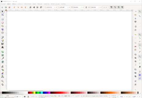
bang!
wow… A great number of features…
A number of words to ask for the first time whether it is a technical term or the result of a goo
d translation … (Bézier curves, calligraphy, etc.)
In addition, even if you look at how to realize what you want to do, there are few articles on how to use Inkscape
ape … (Mostly meso-like content)
It’s pretty hard, but the result of fighting for a few hours is the first thing I put.
Why didn’t I apply?
That’s why I stopped applying as a result, even though I struggled.
This is because I was not convinced by the degree of perfection.
For instance

If you expand it, you will be at a level where you can understand the bounda
ry. (It may be difficult to understand depending on the environment…)
In addition to that, the concept in the first place “Because it is Japan, it is a fan! Now it’s too cheap and embarrassing, or with a sense of “Let’s put this in the middle!” Because I have decided, there is a slight deviation (left and right asymmetry) and it feels bad …
Well, I think that it is good for the first time, but I submitted it to the competition, and on the day when 100 million people were selected as one, I had no choice but to cry and decline, so I will fore off participating this time.
Future
- Learn the knowledge that everyone called a designer would know
- I’m not sure, but the golden ratio? Buy a book w
- We will continue to make
- I try my best to make about one every week.


